Excluded by default
Found 2 critical failures blocking all screen reader users on a live children's product. Delivered a prioritised WCAG 2.1 audit with actionable remediation recommendations. Bookbibuli is a children's reading platform used by parents and educators. Its core promise of "Make your child a reader" implies a product that needs to work for everyone in that ecosystem: children of varying reading abilities, parents across a wide range of technical literacy, and educators managing multiple student accounts. I was engaged to evaluate the platform's usability and accessibility and deliver a prioritised report with actionable recommendations. Client: Bookbibuli Role: Accessibility Auditor Duration: 6 weeks, Jan-March 2026
Client:
Bookbibuli
Role:
Accessibility auditor
Year:
2026 (6 weeks)
Audit Scope & Methodology
I structured the audit across five user flows:
New user onboarding
Content discovery
Reading experience
Account management
Accessibility evaluation against WCAG 2.1 AA
Each flow was evaluated against two frameworks in combination:
Nielsen's 10 Usability Heuristics — to identify general usability failures affecting all users, regardless of ability.
WCAG 2.1 AA Success Criteria — to identify accessibility-specific failures, with particular attention to Perceivable, Operable, and Robust principles.
Evaluation methods used:
Manual keyboard navigation testing — to simulate the experience of users who cannot use a mouse, including screen reader users and users with motor impairments
Heuristic walkthrough — systematic evaluation of each flow against Nielsen's heuristics and relevant WCAG criteria
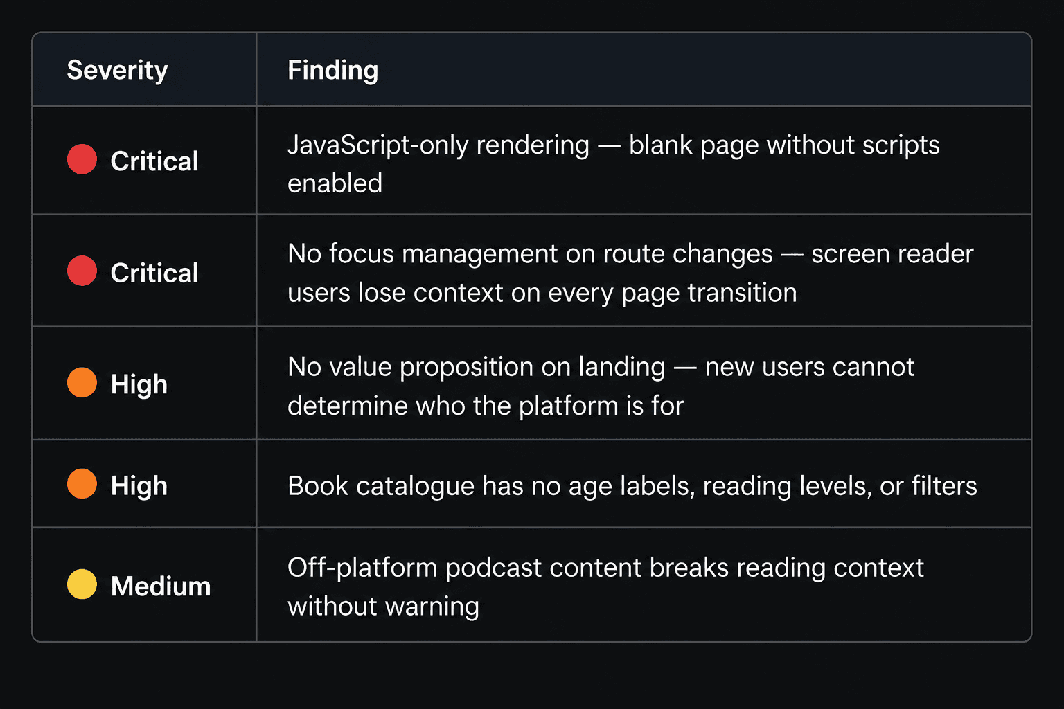
Severity ranking: Each issue was rated on a 4-point scale — Critical, High, Medium, Low — based on two factors: the breadth of users affected and the severity of the barrier created. A Critical rating required both wide user impact and complete task blockage.
What the Audit Surfaced
Eight issues were identified and prioritised by severity and user impact. The two critical findings were structural — they affect every user on every page, and both interact directly with assistive technology access.
Spotlight finding: The form that decided who you are
During the sign-up flow, I noticed something unexpected. Typing in the age field was dynamically changing another field elsewhere in the form. I tested it systematically.
The behavior is this:
Enter any age below 18, and two fields below transform to "School" and "Standard."
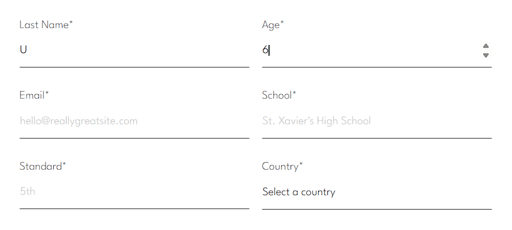
Enter 18 or above, and those fields become "Profession." The logic is technically functional. The problem is what it assumes.
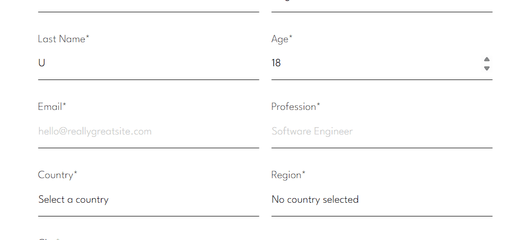
From an inclusive design perspective, this matters because the platform's primary adult user is a parent or guardian — a group that includes many people who are not currently employed. A stay-at-home parent managing a child's Bookbibuli account should not be forced to misrepresent themselves in a sign-up form because the form has no category for their reality.
Inclusive design requires actively asking "who are we not thinking about?" at every decision point, especially in gating flows like registration.
What I recommended: Replace the age-triggered profession/school binary with a single "your role" field that captures the user's actual relationship to the platform: Parent or Guardian, Student, Educator, or Other. This removes the employment assumption entirely, captures more useful data for personalisation, and signals to users that the platform was designed with their actual circumstances in mind.
Five Recommendations, Ordered by Impact
Each recommendation is linked directly to the finding it addresses and the user group it protects.
Implement server-side rendering for all core pages Addresses: Critical finding #1 — JavaScript-only rendering Why it matters: Any user on a low-bandwidth connection, older device, or with JavaScript disabled — including certain assistive technology configurations — receives a blank page. This is a complete access failure, not a degraded experience.
Replace the profession/school binary with an inclusive role selector Addresses: Spotlight finding — age-triggered form logic Why it matters: The current logic excludes stay-at-home parents and non-employed caregivers from accurately representing themselves in a gating flow.
Implement focus management on all route changes Addresses: Critical finding #2 — screen reader incompatibility Why it matters: Without programmatic focus management, screen reader users lose their position on every page transition, making sequential navigation impossible.
Add reading level labels and age filters to the book catalogue Addresses: High finding — undifferentiated content catalogue Why it matters: Parents and educators cannot make informed content choices without basic metadata. This is a core usability failure for the platform's primary decision-makers.
Design an accessible, personalised onboarding flow Addresses: High finding — no value proposition on landing Why it matters: New users currently cannot determine whether the platform serves their child's needs without exploring deep into the product. Accessible onboarding reduces drop-off and sets expectations correctly.
Future Research Opportunities
This audit established the structural and heuristic baseline. The logical next phase is qualitative validation with the users most affected by these findings. Specifically: recruiting 3–5 parents of children with reading differences for moderated usability sessions, paired with screen reader walkthroughs using NVDA or VoiceOver. The combination of lived experience and assistive technology testing would surface experiential barriers that heuristic evaluation alone cannot reach.